

01
The site had to launch before invitations went out, weeks ahead of the event, and with zero room for error
02
Guests ranged from tech-savvy millennials to elderly family members who rarely use smartphones
03
All content, navigation, and interactions needed to work seamlessly in both English and Spanish
From brief to live launch
Full bilingual experience
Guests across all ages
the approach
Decision 01
Information hierarchy built for
guests, not designers
The information hierarchy on this wedding website is designed with guests in mind, focusing on their needs and experiences rather than organizational structures.
Decision 02
Mobile-first responsive design for
on-the-go access
The design allows for one-tap interactions, check details, confirm attendance, and RSVP, making the experience smooth and immediate, no matter where they are.
Decision 03
Typography and spacing that
matched the couple's personality
Clean, modern typefaces paired with generous spacing created a sense of elegance and warmth, mirroring their approachable yet sophisticated style.
Decision 04
Bilingual architecture, not bilingual afterthought
Rather than duplicating pages or adding a toggle that broke layout, I
built the content model to support both languages natively and with the same
structure, same visual weight, zero compromise on either version.
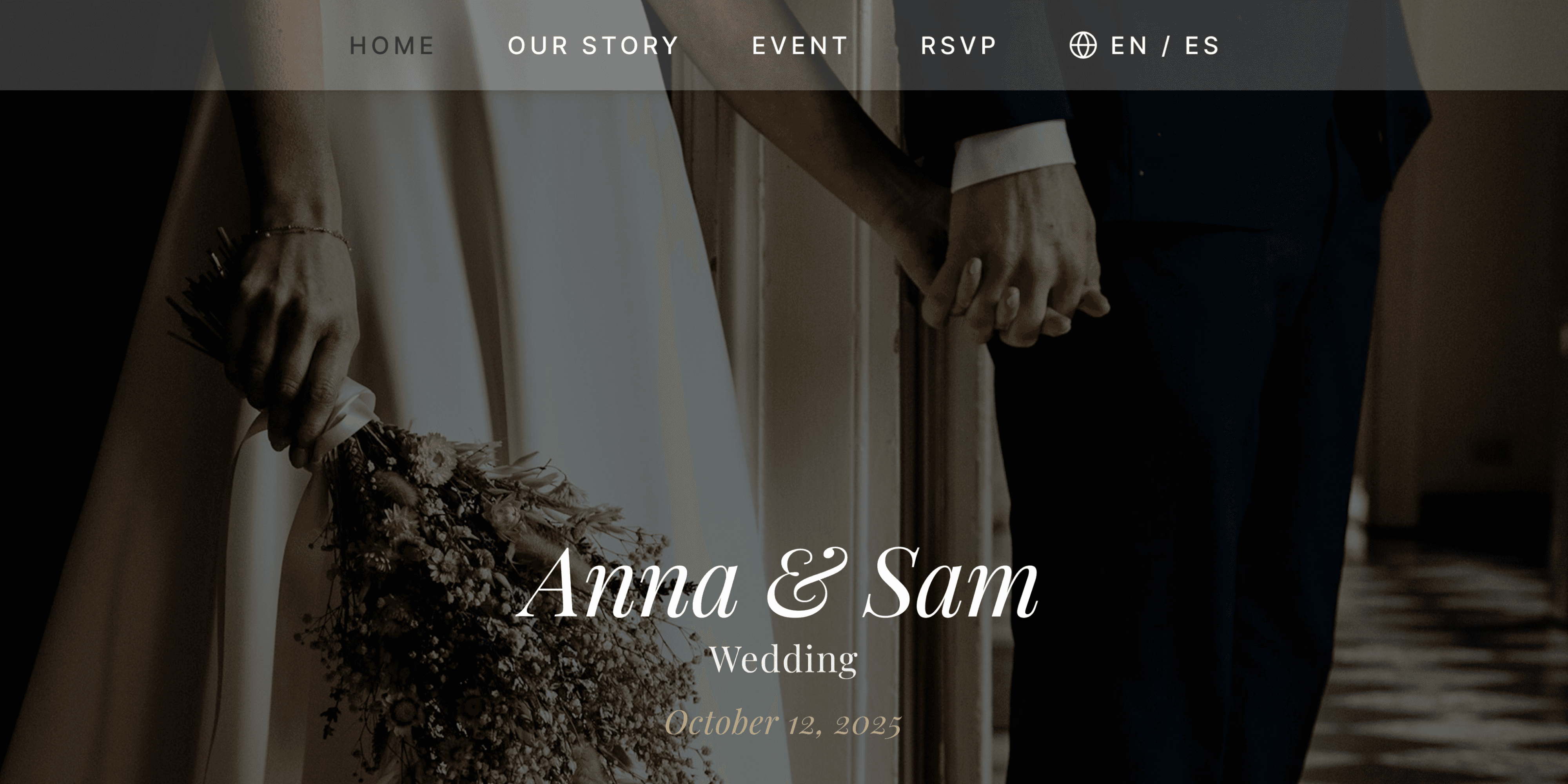
Home
A cinematic hero with the
couple's photo, date, and a
scroll prompt to explore the
story.
Our Story
A timeline narrative of the
couple's journey, with
photos and personal
quotes.
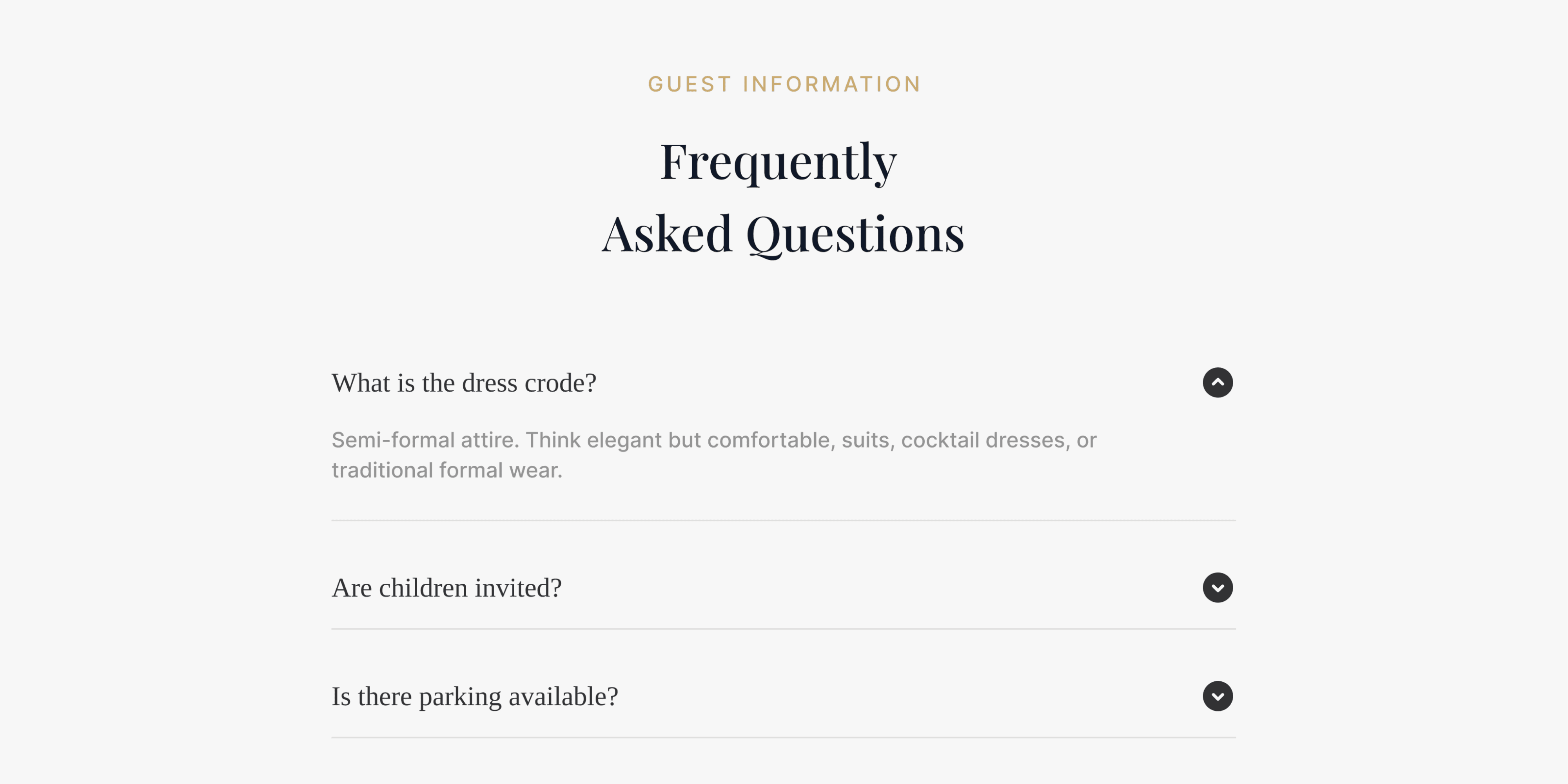
Event
Schedule, venue details,
dress code, parking, and
transportation, all in one
place.
RSVP
A simple, accessible form
that works for every guest.
No login, no friction.
additional feature
what the design achieved
+
Fully delivered and launched before invitations went out
+
Full EN/ES experience, no layout compromise
+
Near zero inbox — FAQ answered everything
+
Became a keepsake the couple plans to preserve beyond the event